Color Psychology at Home
Colors silently influence emotions, energy levels, and even productivity within our homes. Choosing the right palette can create harmony, stimulate creativity, or promote relaxation. Warm tones like reds and yellows energize, while cool blues and greens soothe. Neutrals provide balance, letting bolder accents shine.
Blue is universally calming, ideal for bedrooms and bathrooms. Soft sky shades evoke tranquility, deeper navies add sophistication. Studies suggest blue lowers heart rates, making it perfect for restful spaces. Pair with white or warm wood to prevent a chilly feel.
Green connects interiors with nature, reducing stress. Sage and olive work in living rooms, promoting relaxation. Brighter limes or emeralds energize kitchens or home offices. Plants enhance this effect, doubling as air-purifying decor.
Yellow sparks joy and creativity but use sparingly. Buttery walls brighten dark hallways; mustard accents add warmth to neutral schemes. Overuse can feel overwhelming, so balance with gray or white.
Red is bold and stimulating—best for dining rooms or social spaces. Terracotta or burgundy tones feel cozier than bright scarlet. Accent walls or furniture prevent visual overload. Avoid in bedrooms, as it may disrupt sleep.
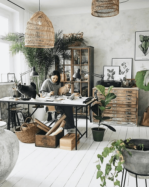
Neutrals like beige, gray, and white offer flexibility. They act as backdrops for rotating decor or colorful furniture. Warm grays feel inviting, cool grays modern. Textured finishes prevent flatness—think linen upholstery or rough plaster walls.
Consider lighting’s effect on color. Natural light reveals true hues, while artificial bulbs alter perceptions. Test swatches at different times before committing. Glossy finishes reflect light; matte absorbs it, changing intensity.
Finally, personal association matters most. If lavender reminds you of childhood, it may comfort more than theory suggests. Your home should reflect what makes you feel at ease. Experiment with samples to find your perfect palette.